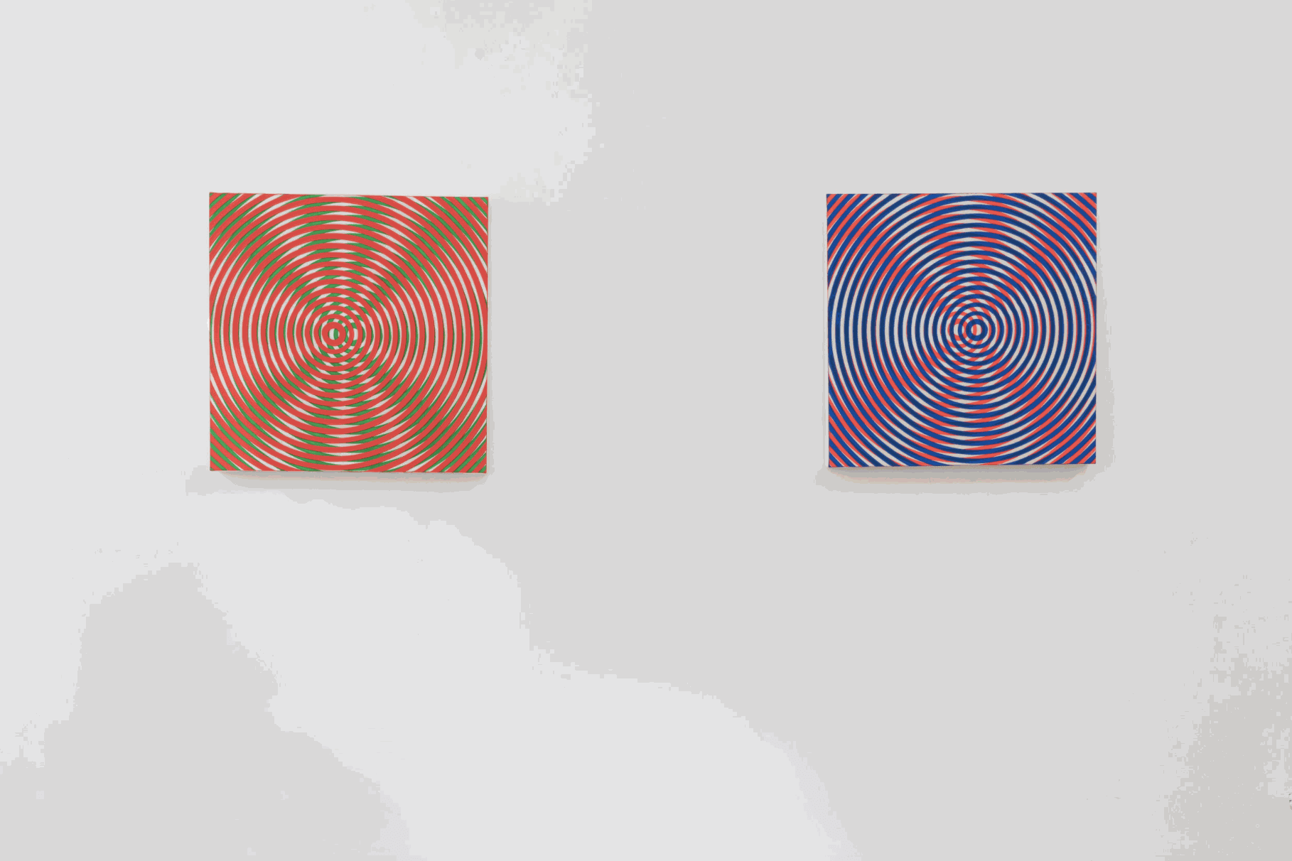


Installation view of Taro Suzuki / Charlotte Hallberg.
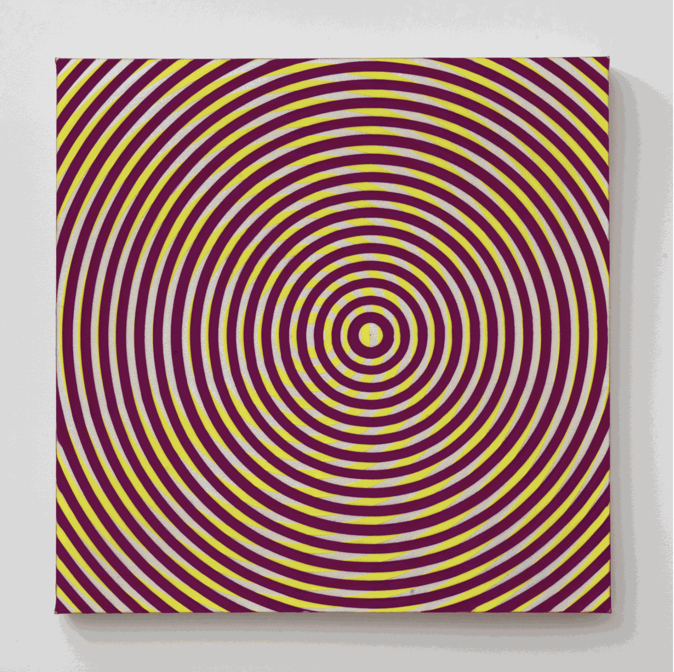
Taro Suzuki’s compositions mesmerize with the seduction of reverberant color; complimentary neons seek dominance over the allure of an opalescent base. Though applied and overlaid to be utterly flat, these designs intersect like patterns of sound. In waves of amplification and cancellation, the surfaces of these panels seem to shudder and ripple with light and motion.
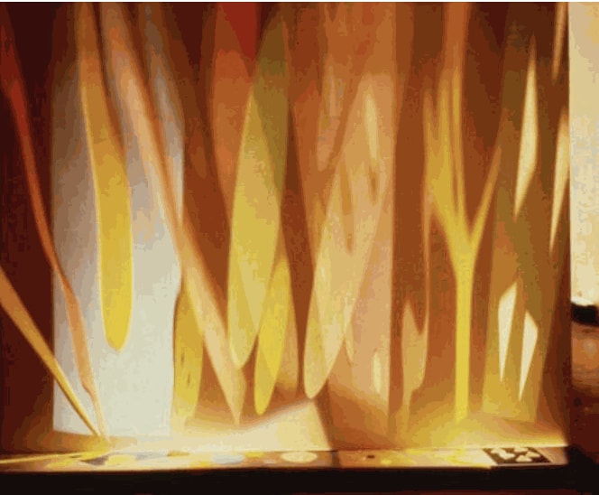
Suzuki came of age in the midst of the charged and explosive beginnings of New York’s 1960s performance scene, first learning to mix color for liquid projections that illuminated concerts by the Grateful Dead and Sly & the Family Stone. Following art school, Suzuki pursued these early interests both in his work and by singing lead for the punk band “Youthinasia”.
Following is an excerpt of a conversation between Taro Suzuki, Mary Heilmann, Jill Levine, Bill Komoski, Mary Clark, Elizabeth Cannon, Jenny Hankwitz, Steve Keister, Gregory Botts, Karen Hesse Flatow, and Nicole Kaack. For the full transcript, please follow this link. This conversation was held in conjunction with the exhibition Taro Suzuki / Charlotte Hallberg.
Karen Hesse Flatow: Did we talk about the Zen and the rage? What was that?
Taro Suzuki: Well, in my paintings, right? When I was on this panel about No Wave, I basically said that getting into my performance was about raging against the end of Modernism, the death of Modernism. That still holds true. I think these paintings are about that.
Elizabeth Cannon: Were you doing the light works at the same time you were in the band?
Taro Suzuki: I was. The light works were thinking about, “How do I get beyond zero?” The death of Modernism ended with Minimalism at zero. The painting becomes an object then. Right? It goes beyond zero, it starts to expand from that single point.
Mary Heilmann: It’s not a picture.
Taro Suzuki: Right! It’s not a picture. It’s an object, and beyond that, it’s physics. It’s light.
Nicole Kaack: Or something that you’re responding to. The location of the image is almost in the viewer, because it’s your eye responding to it in a very particular way.
Taro Suzuki: Exactly.
Mary Heilmann: You know, you guys, you should be sitting here. They’re just wiggling around.
Karen Hesse Flatow: As you move around the room, they move with you.
Mary Clark: It’s vibration. Like quantum physics, before that was popular.
Elizabeth Cannon: When I first saw this group of paintings that you did for this show particularly, what struck me was the fact that you had two centers. You made a decision to have two centers to the paintings. Very conscious decision. And through that decision, you’ve created a third entity, which doesn’t exist anywhere except in the eye’s perception. The warping of the picture plane. It looks like a radiation. It’s the warp that you get when you look at them from a distance. Not close up. I don’t even really see it now, but if you look at it in certain lights, you see a radiation out.
Mary Heilmann: If you sit and stare at it.
Karen Hesse Flatow: An undulation. It’s almost a wave.
Elizabeth Cannon: But it’s not from two centers. You managed to get it to radiate in one piece not two. You created a third thing from two.
Steve Keister: The third thing being the moiré pattern. My contention is that the optical effect is squared. It’s exponential. Because you have both the color vibration at the edge, the optical color vibration, combined with the moiré pattern, which is its own vibration.
Taro Suzuki: Yeah, I was going for maximum impact. I hadn’t used fluorescent colors in a long, long time. And Gregory’s actually responsible for that. A couple of summers ago, up at your place, Greg was just musing, “You know, you don’t use fluorescent colors anymore.” I said, “No, I don’t.” And he was, “Maybe you should go back to that.” Just like that. I thought about it. And I thought about it. And you know, then I started playing with it.
Gregory Botts: Well, I thought that was kind of your trademark back in the early days. I didn’t know Taro that well, back then. But I knew you, in my mind you were that fluorescent guy.
Steve Keister: I think it especially works well because it doesn’t depend on the fluorescents. Fluorescents, non-fluorescents, it’s all working together. I have another idea, where it’s a combination of Duchamp and Warhol. You have the Duchampian hypnotic.
Taro Suzuki: Like the roto pieces?
Steve Keister: And with Warhol, you’ve got the missed registration. It’s kind of like a printing technique.
Taro Suzuki: Yeah! I was working with that in the back of my head for a long time. For years and years. Bill came over to my studio, I don't know, in 1990-something. And I just started using printer’s palette. And you were like, “Yeah, that’s the way to go.” And he said, “What are you using for the blue?” And I said, “I don't know, cyan?” And he goes, “Cerulean!” [laughter] Right, do you remember that?
Bill Komoski: No! In fact, that was probably about the time I was starting to play with that.
Karen Hesse Flatow: From one studio to the next.
Nicole Kaack: [to Bill] The printing technique specifically?
Bill Komoski: No, but that three-color separation. I think I was definitely trying to figure out what would be the best blue. Because cerulean is actually a little bit, it seems like it should be right, but I found—
Taro Suzuki: It’s a little green.
Bill Komoski: Yeah.
Elizabeth Cannon: Then there’s that pearlescent color you use on the base. I just started thinking about that pearlescent because I find these paintings have this push and pull. That pearl color is like inside of a shell, it’s like a mystery. Where are the depths? You are also putting the gels inside the painting rather than on the top, so there’s depth inside of the paintings. It used to be like his surfaces had like 100 layers… he’d come home at night and he’d say, “Well, I’ve just put on the 59th layer of gel.” It’d be day after day after day after day. It was this practice of putting on the gel, so laborious.
Mary Heilmann: Is that about these paintings?
Elizabeth Cannon: No! Now, these paintings don’t have gel on top. Correct me if I’m wrong?
Taro Suzuki: They have half as much gel — only have 30 coats. Over the pearl gets gel so that everything is really flat. Say this one, gets the red layer. And then there’s some texture there, because the red has some actual physical depth. So that has to be made flat again, by putting on coats and coats of gel over it. It also has a sort of lensing effect, magnifying the pearlescent and settling the color, like the red. It kind of evens it out. Because it’s being magnified a little bit. That pearlescent comes from… the East Village, around the corner from me, back when I was in school, there was a sign painting supply store. M. Horowitz. It was like this magic shop out of The Twilight Zone. That store was there since 1890 or something, and he was selling supplies that were antique. He sold a lot of glittery kind of materials. I discovered glass beads there, reflective beads.
Jill Levine: Diamond dust and glass beads and aluminum powder. All that really toxic, crappy stuff.
Steve Keister: Barbara Gladstone was really on the case with this kind of new wave kind of looking art. Especially with the fluorescents, angular fluorescent. So she had a group show in ’79. The original Canal Street show. Taro and I were in it.
Taro Suzuki: Nancy was in. Tom Rankin was in it.
Steve Keister: Judy Pfaff was in it.
Taro Suzuki: Frank Shroeder was in it.
Steve Keister: I think that’s probably it. If I think of the photograph that Richard Prince took of us, sitting in front of Dave's Corner for the announcement for that show, I think we’ve named all the people. That was ’79, and then how many years ago? Five years ago, Mitchell Algus restaged the Canal Street show in his gallery in Chelsea on 25th Street. He republished the Richard Prince announcement of the original. He put Dike Blair in the re-staging.
Elizabeth Cannon: Was it the same work?
Taro Suzuki: It actually wasn’t. I had some much more saleable pieces. They were metal wall pieces that cast shadows, and adjacent to the shadow was paint on the wall. What I did for Mitchell were mirrored light pieces, where a single pin spot gets bounced from element to element around the room, from different mirrors.
Steve Keister: I remember you showed those in Cincinnati at a group show called “Dynamix” that was an expanded roster of “energist” artists.
Gregory Botts: So then there’s the Dan Newberg gallery. Where did you show at between the two things?
Taro Suzuki: Stefanotti. On 57th Street. He had a hallway, and it was pretty narrow and long. I did a lot of installations in that hallway. I could just bounce light back and forth down this corridor. I changed all the fluorescents to black light tubes. It was fun.
Steve Keister: So you remember Ronny Cohen?
Taro Suzuki: I do remember Ronny Cohen. I didn’t want to participate in her final Energist thing.
Steve Keister: The article? That’s one of my really distinct memories, is that she was going around to our friends’ studios, and everybody was really excited to talk to her. And then the issue comes out, and all of a sudden it’s called Energism?
Taro Suzuki: I know, right! So embarrassing. It’s on the cover.
Steve Keister: Jonathan Borofsky was on the cover.
Taro Suzuki: Right, yes. But he was part of the article. She got the cover story.
Steve Keister: And Jeff Koons was considered an Energist at that time.
Nicole Kaack: With what work?
Taro Suzuki: The vacuum cleaners. It was Plexiglass. That’s an industrial material.
Karen Hesse Flatow: So Taro, what’s next?
Taro Suzuki: After Energism?
[laughter]
Mary Clark: I’ve been wondering about that phrase you used earlier, “the rage against modernism.” Keeps bouncing in my head. Like is that something that’s in your head all these years?
Taro Suzuki: I think so. Bill — at my birthday — described postmodernism as this lack of an overarching narrative that united Western art. Is that fair?
Bill Komoski: Yeah. Or rejection of any kind of grand narrative.
Taro Suzuki: Greg also invoked a weird thing about religion and put it with modernism. But I think I got what you were saying. I think what I equate with modernism is the idea of social progress.
Steve Keister: That’s been part of it, historically.
Elizabeth Cannon: Belief in the future. Moon landing.
Taro Suzuki: Exactly! So I guess when I got out of school and saw that it was all gone, I was pretty pissed off. [laughter]
Mary Clark: You were here to start it up again. Redefined.
Elizabeth Cannon: Circles. Sisyphus.